Using the language function for multiple voices

We all understand the importance of incorporating multiple perspectives into exhibits. It’s part of a growing understanding that there is no single source of truth, but many different ways of looking at pretty much everything. 

Curio has many ways to help to express that multiplicity. One of them is to re-purpose the language feature. By renaming a “language option button” as “a different perspective button” you can give visitors the choice of which perspective they want to know more about. 


Here’s how it works:

  • Say you want to create a Curio exhibit about a particular display case. The original content on your highlights could be based on material provided by expert curators. But you also decide you want to add in a child’s perspective, and just for good measure, a fun facts layer called “Quirky Facts”. 

  • You might create the “Curator’s Notes” layer of highlights first. To give it that name, select Languages from the main menu on the left. Click where it says English (the default language in Curio). Then click on the little pencil to the right, and rename the layer “Curator’s Notes”. 

  • To add another perspective or layer, let’s say, “Just for us kids”, go to Languages again, and choose another language from the pull-down menu. Choose any language - let’s say Abkhazian. Press Add Language to select it, and again change the name of the button to “Just for us kids”. The choice of the language does not matter. You are simply using the pull-down menu to create new perspective options for your content, and it happens to be pre-populated with the names of languages (given its original purpose). As anywhere in Curio, you can still input your content in whatever language you like. 

  • Now that you have two different perspectives or layers on your interactive, their respective buttons will appear on screen. You can go ahead and create a third perspective such as “Quirky Facts” in the same way. You can add as many as you like (and can fit on the screen).  

The Language function is used by renaming languages and using them for different voices or perspectives.

The highlights in each perspective layer will be on the same places on the hero image, but the content of each highlight can be completely different. The “Curator’s Notes” might include detailed text and expert video, whereas the Child’s Perspective might feature fun, brief notes and audio interviews with kids. The “Quirky Facts” layer might consist entirely of bullet points. It’s totally up to you.

There’s no reason why you couldn’t also use the language option for the purpose for which it was originally designed in the same Curio interactive. That is, to add real “language buttons” alongside your “perspective buttons” to incorporate content in other languages as well. 

Happy Multiplicity! 

How to use Curio for FREE

We want to make Curio as accessible as possible - part of our vision in creating this software was to make digital interactives more affordable. So, we’re offering everyone a free trial account.

Once you sign up for a Curio account, you are automatically assigned a free trial licence.

With your trial licence you can:

  • make as many projects/interactives as you like

  • connect as many touchscreens to your account as you like

  • publish a project to a touchscreen (but you can only have one touchscreen live at a time)

  • update (or change) your project as often as you like

  • watch the analytics to see what your visitors are enjoying the most.

You can see your license status in the top right of your screen, once you’re signed in.

This lets you really try the software and publishing platform out from end-to-end to see if it meets your needs, before you get a paid licence. It’s designed to be used for a limited time, but we’re pretty generous on how long that is, depending on your situation.

The upgrade to a paid licence means:

  • the Curio “badge” that appears when using a trial licence is removed

  • you can publish to as many screens as your licence allows

  • this can be the same interactive, or a different one to each screen and, of course, you can update/change them as often as you like.

The Curio “badge” is in a blue box across the top of the screen - appears in the free trial licence only.

It doesn’t matter if you’re on a trial or paid licence; you’ll still enjoy the same fabulous customer support Curio offers. We’re here to help you every step of the way.

So, you have no excuse to start getting creative, and making your own interactive - for free. Just start your journey here.

How COVID has changed our audiences

It’s hard to be grateful for a crisis when you’re still grappling with the fallout. Like it or not COVID has changed the museum world, for now at least. In New Zealand and Australia our museum doors are open again, and slowly doors are opening in other places too, even if it is with some restrictions. So, life is getting back to normal - but is it?

In our previous newsletters I’ve mentioned a great source of data from Colleen Dilenschneider who has been releasing updated data on how museum audiences have been affected by COVID in terms of what will bring them back. There’s a useful article here, particularly for our USA readers.

A more interesting trend however, is the increase in LOCAL audiences. With the lack of international travel, locals are exploring their own country, and neighbourhoods with fervour.

Have you thought about what changes you should make when telling your stories for this audience?

  • Can you reflect your community’s voices in your stories?

  • Can you refresh constantly, to be fresh, and new and to stay relevant and encourage repeat visitation?

  • Can you use local languages, accents, and dialects?

precious screen.png

This exhibition from the National Library of New Zealand does just that. It’s called “Precious” (pictured above) and it heroes a class of students from local schools, on a rotating basis. Each student brings in an item that is precious to them, and then records a video explaining why. I popped in the other day to see the latest school featured - and it was quite some time later before I realised I was now late for a meeting! Absolutely intriguingly cute stories told by the community, and constantly changing.

Of course, it’s powered by Curio, which makes updating the content a breeze.

I wondered too, if a similar exhibition could be staged, using objects your community found valuable during lockdown.

This new local audience is an opportunity to connect with perhaps our most important audience of all. The communities that make museums possible and needed.

I think we’re going to end up being very grateful for the “reset” that COVID has given us, and the chance to focus our attention on those nearest to us, who perhaps have been overlooked?


Technical specs and questions answered

This post covers many common questions - as you’ll see there isn’t always a definitive answer as it often depends on a combination of things - but this should give you a good guide to media, hardware and technology q’s. If you have your own question - reach out to us we’re happy to help you.

HARDWARE

There’s a TIPS post about some hardware recommendations here. In any hardware selection for in-gallery, public use, you should be looking at industrial level hardware – designed for 24 x 7 enthusiastic use.

For Curio to run you will need:

A touch screen – if you can stretch your budget to 4k (especially if it’s a large screen) then do - it’s a higher resolution. That will serve you well for a long time and allow lovely deep zoom into images.

When putting a screen into the gallery, you also need to hide the buttons on the touch screen, so the public can’t adjust volume, turn things off etc. – if buttons are visible/accessible they will be fiddled with! More about touchscreens here.

A computer – a little bit of grunt is recommended – especially if you want run video, high res images, etc. Video in particular will go better if your computer has a processor of 2.5GHz or above (and more than 2 cores). We’ve been using a lot of small form factor computers in galleries over the last few years with great results, but you still need a fast processor.

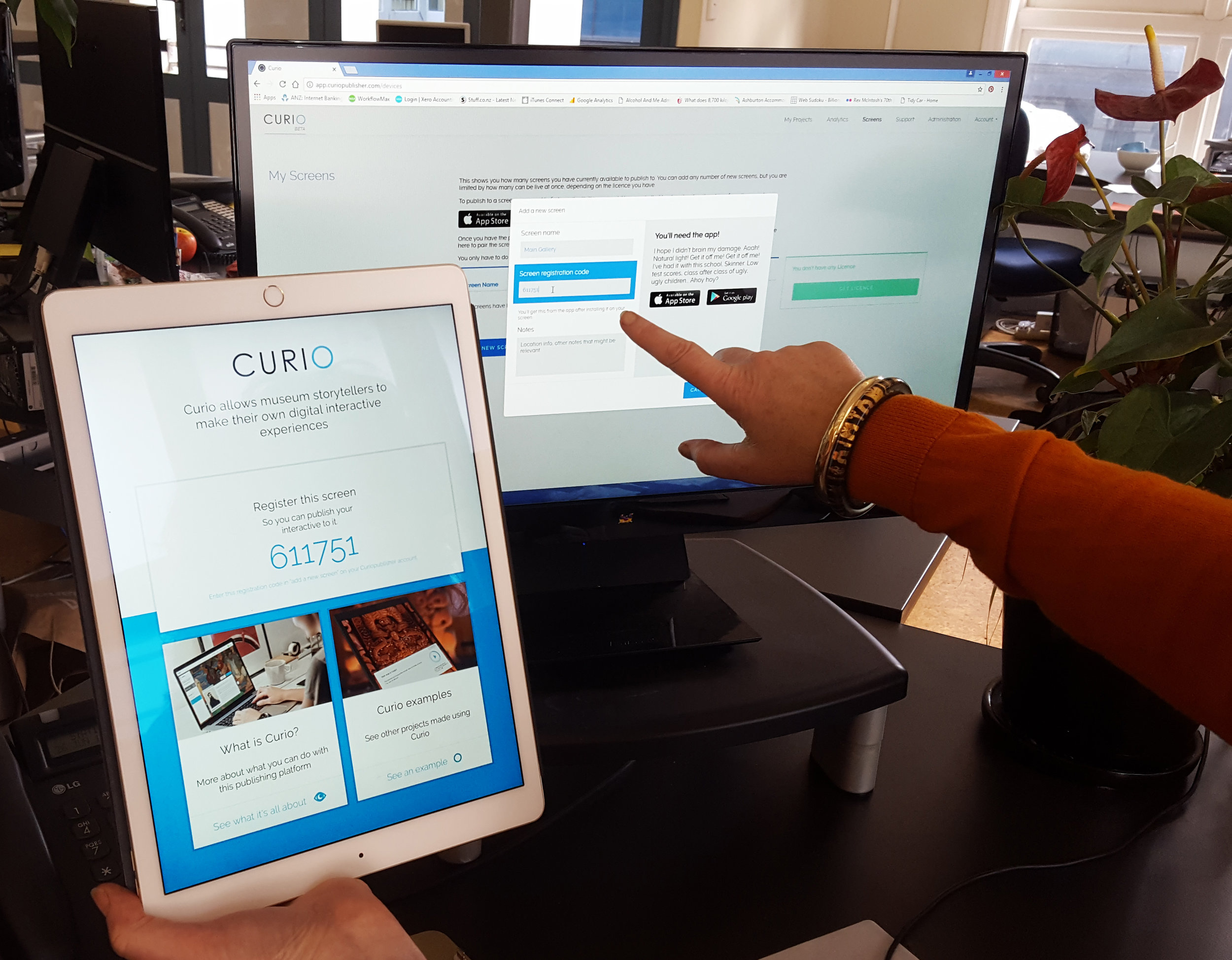
You will be downloading a Curio player onto this computer. The Curio applications can be downloaded here for Windows and found in the app store for iOS.

Note: you’ll need speakers as well, if you’re having audio and video in the interactive.

Internet connection – Curio relies on internet to publish the project to your gallery computer. Then, it will check, over the internet, to see if there’s a new version. In particular it won’t start up, after being powered down, without internet connection. However, if your wi-fi goes down, and you leave Curio running, it will just keep on working. Like any good museum interactive, it can cope with a loss of internet.

The other advantage of always having Internet to your interactive, is it enables the collection of your analytics, and we know these reports are very popular – once you’ve started getting them, you won’t want to be missing out!

Video

There’s a TIPS article about how to compress video here, but the recommended specs for video are:

  • format needs to be mp4 (best)

  • we suggest  you encode the video with H264 / AVC

  • keep the file size relatively low – but keep the resolution 1920 x 1080 or, if on a 4k screen, 3840 x 2160. (That’s all you need for the video to play full screen – so any more just adds unnecessary file size)

  • we have a 40MB file I demo with which looks incredible on an 85 inch screen – so without being huge, limited file sizes on videos means they can still look amazing

  • subtitle files should be .vtt

Large video files (over 40MBs) will take longer to:

  • save when you’re creating your interactive

  • publish to the Curio Player

  • load for the first time when you open the Curio Player

So, saving and publishing projects with lots of video files just requires a little patience – and a very good internet connection.

(In most cases problems are caused by your computer/browser/internet speed while you’re creating and publishing the project)

If you have trouble – read also the notes on file names below.

Pesky file name issues that can trip you up

File names (esp. Apple)

If you are publishing out to Apple hardware e.g. an iPad, then you need to ensure your files names do not have strange characters in them or this will cause issues with the project loading on the iPad (invalid block type).

Long file names – over 100 characters – can also cause issues with the project loading.

File paths (esp. Microsoft)

Another trap – if your file name is short is to check the file path. If you are loading (for example) an image that you load from: mycomputer/special long directory name/that folder with an even longer name /a sub folder that also has a very long name/you get the idea/image name.jpg and that file path is more than 260 characters – you’ll also find it causes an error (common within Windows).

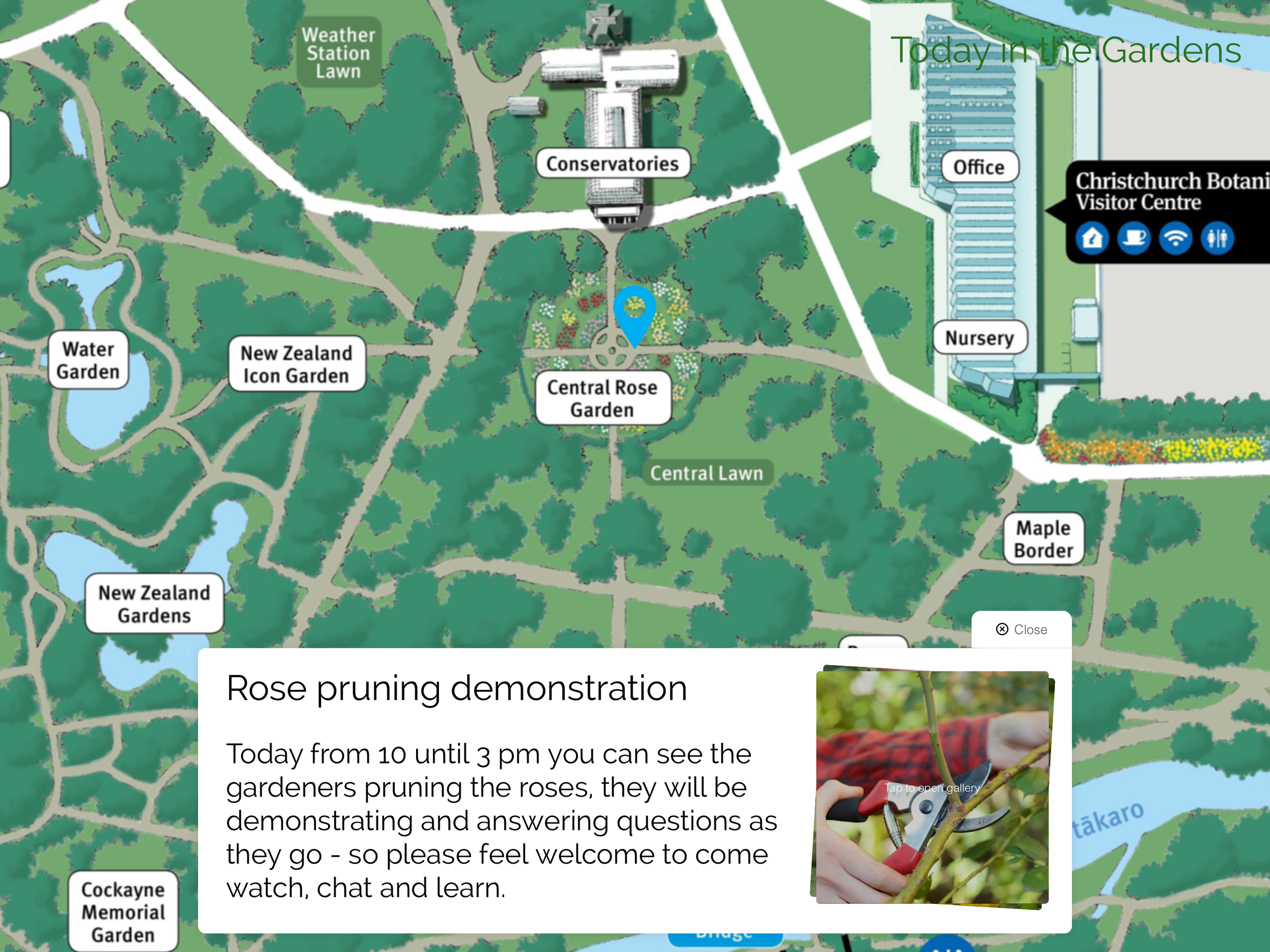
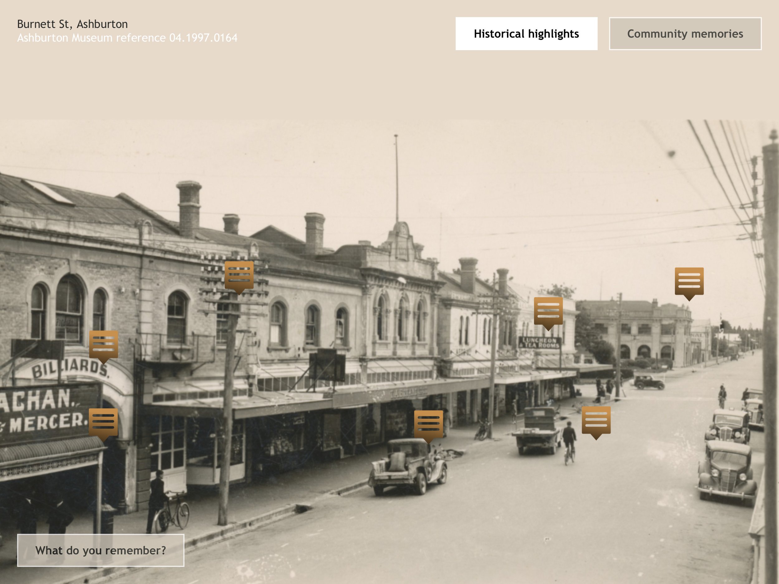
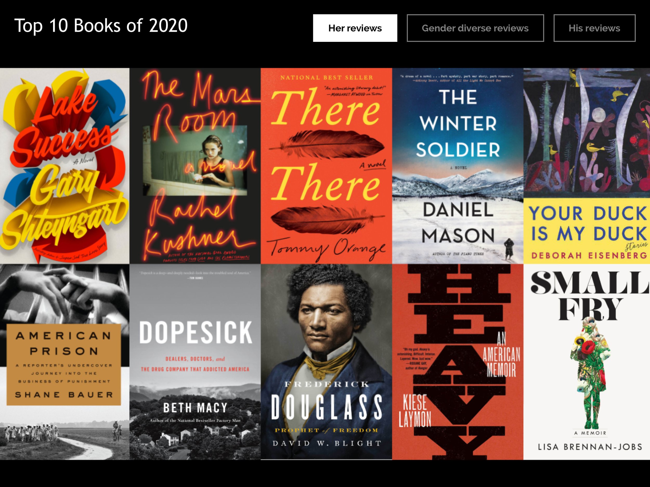
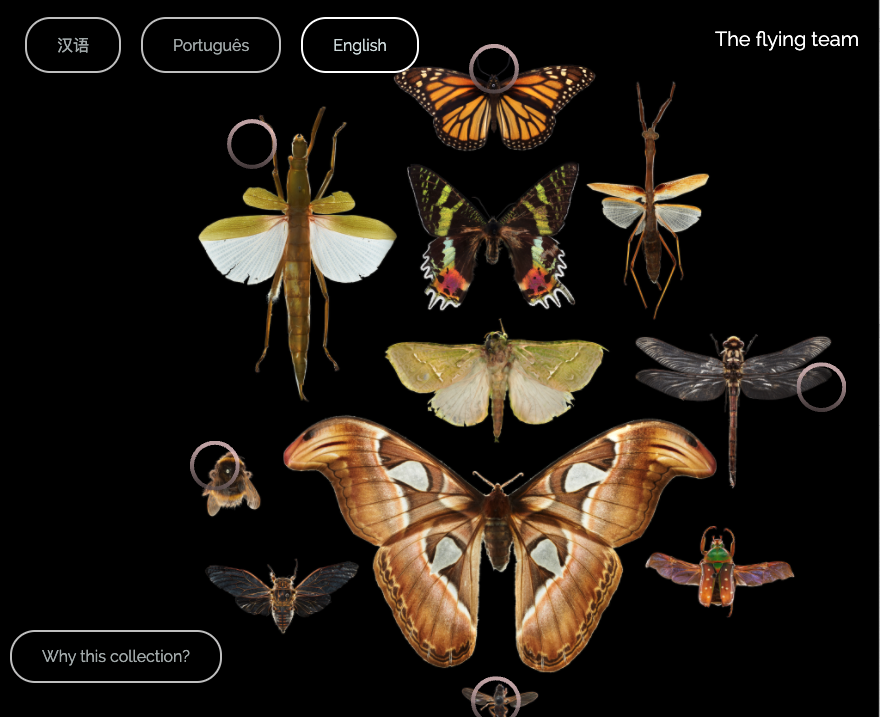
Size of your hero image

Your hero image should be no more than 10 MB.  BUT it’s the resolution that is the most important thing here – You want the image to have at least twice as many pixels as your screen, so visitors can zoom in on the detail. The more pixels the better the zoom experience.

Where your hero image is twice the resolution of the screen, visitors will be able to zoom the image to twice its size (and no further), if three times the screen resolution, the maximum zoom will be three times etc.

This means that the image will not degrade, because even at maximum zoom, the image is presented at full resolution.  

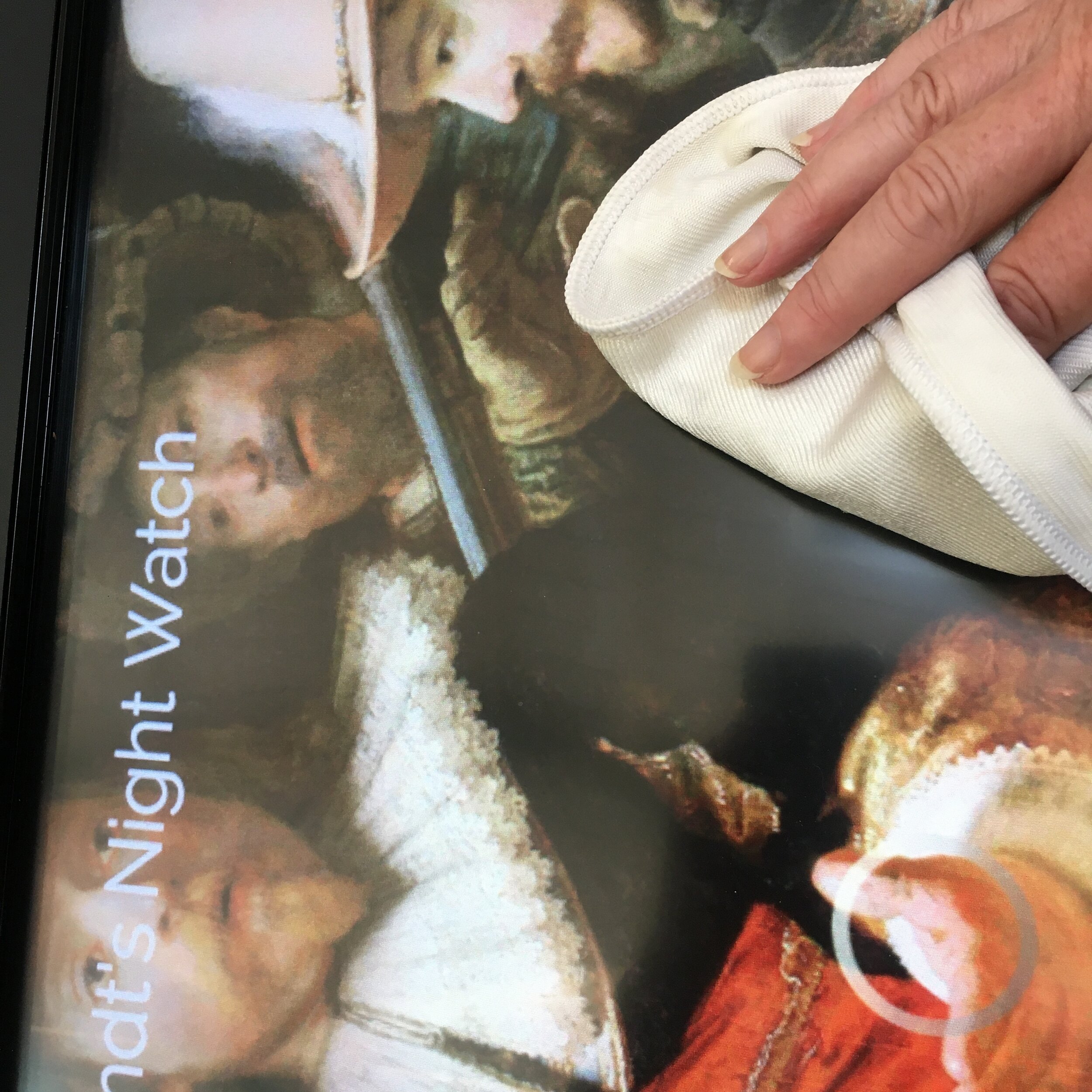
A sample project we adore, is an interactive on the Rembrandt painting, The Night Watch. The hero image here is 14,168 x 15,528 pixels and the file size of that image is 9.7Mbs. That means the visitor can zoom right into tiny brush stroke details and enjoy incredible detail – and it’s quite engrossing when you do. (We’ve seen this displayed on an 85 inch Ideum table – and it’s gob-smackingly impressive.)

So, yes, under 10 Mbs – but get the most out of that resolution.

Another thing to consider when thinking about pixels is the shape of the hero image should mirror the screen, ideally. You’ll be able to add a background colour to fill the remainder of any screen area, so it’s just a general consideration. (Landscape image = landscape screen)

Note: the image we have used for the Night Watch comes from the super-accessible Rijks Museum collection online here.

Your Own desktop set up

You’ll need fairly good internet access (especially upload speed) if you’re publishing videos - and a little patience; when you’re saving and publishing large files your browser is busy - but with the right access, it’ll get there.

You can’t create interactives using an iPad (you need a mouse to drag and drop the highlights in place); but they can published to an iPad, of course.

Browser

You’ll have a much better experience if you’re creating your projects using Chrome, or similar modern browser. If you’re using Internet Explorer (the bane of web developers lives!) then you may find some features, such as the colour picker when you’re choosing button/font or back ground colours, is problematic.

MORE questions?

Have we missed your question - reach out to us we’re happy to answer any quesitons.

Keeping your touchscreen (publicly) clean.

In these times of a Global Pandemic, but also in all times, keeping frequently touched surfaces clean in a museum, as in all public spaces, is critical.

Better still, if you do it in front of your visitors (also known as “The Theatre of Hygiene”) it doubles regular cleaning with the reassurance to visitors that you’re on top of it, and that your surfaces are regularly cleaned. (Wouldn’t we love to see this happening on public transport!) Is there an opportunity for you to incorporate cleaning into the character of your museum and turn it into theatre? How could you make it a spectacle that creates fun and reassurance?

In terms of your touchscreens, cleaning is fairly straightforward:

  • a fine mist of glass cleaner can be applied to most touch surfaces, and then wiped off with a soft, lint-free cloth

  • you can also use disinfecting wipes, and carefully wipe the surface down

  • if you don’t have a glass cleaner you can use any wipe or cleaner with 70% isopropyl alcohol

  • always apply cleaner very sparingly - don’t use a high volume of liquid

  • don’t use aerosol sprays, bleaches or anything abrasive

  • minimise the wiping, so as to avoid any damage

  • make sure the cloth you use is soft - paper towels are NOT recommended.

Screens should be cleaned as frequently as is practical for your team; keep supplies handy so a moment of downtime can be put to good use - and your visitors see you doing it which serves to reassure them.

clean screen.JPG

Hardware options for your in-gallery experience

This post attempts to summarize the many conversations we’ve had with you all over recent weeks on hardware options for displaying your Curio interactive in your gallery (or even outdoors!).

There are many options for touchscreens and mounts, and I’m certainly not endorsing any particular avenue - these are just some of the things we have had experience with, or that our other Curio clients are using.

Using an iPad as a touchscreen

This is a popular option mostly because the iPad comes with a built in computer and touchscreen all in one and as such; it’s a cheaper option. (Although, the screen size is limited to 12.9 inch max - if you want a screen size better suited to two or more people looking together, then scroll on.)

Once you have your iPad you download the Curio player onto it, and then you’ll need to mount the iPad into some kind of stand to secure it, and to prevent visitors fiddling with the controls, turning it off or clicking the home screen in an attempt to quit the program.

Mounts can be floor standing or even wall mounted. One of our customers has used these ones below to clip the iPad onto a display case, where it provides the interpretation of the objects in the case:

These wall mounted options have come from Bouncepad.

These wall mounted options have come from Bouncepad.

These floor standing options (the left hand one showing a branding panel that could be added) have come from Armodilo.

These floor standing options (the left hand one showing a branding panel that could be added) have come from Armodilo.

If you’ve ever met us at any of the Museum conferences we love to hang out at, then you will have seen the right hand stand in action (it can fix to the floor) and an example of the left hand model, featuring a Curio interactive in an art gallery context, can be seen here.

Once you have your iPad ready to go live, you’ll need to turn on guided access (kind of setting a kiosk mode for it) to take the final step in locking the iPad down, so no-one can break out of any software you’re running on it. There’s a useful TIP on how to do this here.

So, there’s a few off-the-shelf ways to get an iPad into a gallery space.

Using a regular old touchscreen (and a computer)

When we are recommending hardware a lot depends on the situation the screen will be in; what it is displaying and; what we want to achieve. However, there’s a lot to be said for ELO open frame touchscreens (though we also LOVE Planar touchscreens for outstanding quality). The open frame screens don’t look so pretty, like a regular TV/monitor, instead they come with bolt holes ready to mount to a surface. The image below shows you an open frame screen that has been mounted into a beautiful carved wooden frame.

fenton agreement.jpg

You can also mount a touchscreen into complete custom made units, such as for these tables that allow you to explore historic documents in detail at the He Tohu exhibition:

doctable3.jpg

The thing is that you do need to mount a screen into something - even just to hide the control buttons that would otherwise be accessible to the public. If they are exposed, visitors WILL fiddle with them.

To drive the touchscreen, we’re likely to recommend small form factor computers, that can be easily housed within an exhibition space and deliver incredible performance. They can include Intel NUCs as an example. You really want a computer with a 2.8Ghz processor + and don’t be tempted to save money by buying a laptop style CPU (which tries to save power); instead go for a multimedia/gaming style which is always on and ready to deliver interactivity.

The great outdoors

We’ve also been looking into touchscreens that work in an outdoor setting. We saw a pretty impressive TV screen in the Daintree rainforest recently which made us realise that outdoor screens have come a long way in the last few years.

These weather proof touchscreens from STX are ones we have investigated recently:

Again these water and weather proof touchscreens deliver superb quality and can be mounted in a variety of ways. (They also come with a choice of surrounds and look quite sharp in black.)

If you need any help deciding what to use, what size to go for, etc then drop us a note. Our hardware expert has been installing hardware in museums for 25 years - he knows a thing or two; and we’re always happy to help.

Setting up an iPad as an in-gallery touchscreen

An iPad can be a great device for a public-facing interactive like Curio. The form factor is small and light, and there are many “tamper proof” secure enclosures available off the shelf.

As with any touchscreen, you need to make sure that the public can’t  break out of your application, and Apple have made some tools for exactly that. The trouble is, it’s not all that intuitive, so our hardware expert, Rex McIntosh, explains how to set your iPad up for success:

  1. First, you want the iPad to stay awake, so ensure the power adaptor is always plugged in.

  2. Next, enable the auto-lock so the screen never goes to screensaver/black. Do this by going to Settings, Display & Brightness, Auto-Lock, and select Never.

  3. That’s the basics handled, now you want to lock the iPad down, so users can’t access the power button, or swipe up from the bottom and open other applications. It’s known as “Guided Access”. (Note: this has changed in the latest version of iOS 12.1.1 which has caused frustration for existing users of IPads - if that’s you - read on, help is at hand.)

  4. To do that go to: Settings, General, Accessibility. Scroll to the bottom to find “Learning, Guided Access”. Turn on “Guided Access”

  5. Next, you need to create a Passcode, so you can stop Guided Access if you need to do anything to the iPad. Go into Passcode settings and input a PIN.

  6. Next, turn on “Accessibility Shortcut” so that triple clicking the home button will enable and disable the lock-out. (This lets you break out of Guided Access mode, and you’ll be asked for your Passcode - again so if visitors did happen to triple click the home button, they’d need a Passcode to break out of the Curio application).

  7. Then, here’s the real trick to ensure the screen really doesn’t go into screensaver mode - from within the Guided Access setting, turn on “Mirror Display Auto Lock” this ensures the lock time you set earlier also applies when the iPad is in the “Guided Access” mode.

  8. Last step - promise - now run your Curio software (the interactive you’ve made) and click the Ipad *home button three times (quickly). That will bring up a prompt offering you the choice to START Guided Access. Do that, and you’ll be locked (literally) and loaded. Later, when you want to quit the interactive - repeat this step and turn the Guided Access back off again to exit Curio.

    *Note - if you’re on a newer Ipad pro without a home button, then press the power (sleep/wake) button three times instead.

If you have issues - do make contact with us, we have a LOT of experience with in-gallery technology!

Emily standing next to our demonstration iPad, in a stand, at the Alliance of American Museums awards night - did we mention Curio won SILVER??

Emily standing next to our demonstration iPad, in a stand, at the Alliance of American Museums awards night - did we mention Curio won SILVER??

Collaborating with your colleagues

A great feature of Curio is that you can invite colleagues to join your account. That means you can:

  • work on a project together - imagine getting someone to add the translations direct into the software; or add the image caption text in for you? (Think of the email trails you’ll save!)

  • share the analytics so others can see how the interactive is being used, and even compare performance between similar interactives.

  • create a customised “theme” which sets the onscreen elements such as text or buttons, in terms of their colours, layout, size and shape. You can name that theme and then it is available for anyone else in your organisation to use. This could be a theme set to match a specific exhibition design, for example, and you could even ask the exhibition designer to join the account and set those styles for you. (There’s more on customising the look of your interactive here. )

inviting someone to join your organisation

To invite someone to join your organisation, simply go to your Account/Organisation and there you will see a unique combination code. They can then go to the Sign Up page, create an account, and click “Join an existing organisation” where they can enter your unique organisation code:

org code.png

If you need to remove someone - we can manage that for you. We’re here to help you, every step of the way.

Accessibility - how to reach all your audiences.

Accessibility is a key priority for museums everywhere as we all strive to be inclusive for everyone visiting the museum. Curio is designed to make it super easy to reach a variety of audiences and I’d like to share some tips on how you can do that.

Audio descriptions for sight impairment.

First, let’s think about those with impaired sight, or even total blindness. Adding an audio track where you describe the object in detail allows those visitors to “see it” by listening.

audio description for blind.jpg

In this case we’ve done this by using the “Overview” button, and adding an audio track to that. The track can then be selected and played for visitors. The description covers things we may take for granted like the size of the object, it’s mood, colours and story, as well as its physical attributes.

Including sign language

There are a few ways that you can include sign language using Curio. In New Zealand it is an official language that we simply don’t see enough of. You would need to shoot the video and we have a lot of experience and can help you with advice and contacts. (Contact us for any help at all.)

First, you can add sign language videos into any highlight by uploading them as you would a normal video.

add sign language.jpg

Secondly, you use the language function to add another language. Having done that you can name the language by editing its display name. This could then display a language button (e.g. “a Deaf perspective”) and all the content on each highlight could be told from that perspective. It means sign language videos could be included as an alternative for this “language” and audio tracks could be replaced with sign or text alternatives.

(This can easily apply to a number of specialist audiences; the example below is content catering for younger children)

9fc19bb5-25d0-400c-abdd-336014518c0e.png

adding subtitles to video

Another way to make video content accessible for those who can’t hear is to add subtitles.

video subtitles.jpg

To do that you add your subtitle file (.vtt) as you would for, say, a You Tube video, when you upload your video.

It’s worth remembering that subtitles aren’t always the easiest way to “watch” a video as reading at the pace of someone talking can assume excellent language and reading skills, plus you can miss much of the imagery when you’re busy reading.

Keep text legible

Another thing to think about is ensuring your on screen text is easy for everyone to see. Curio has a fabulous customise tool to let you select colours, fonts, sizes and background colours. As you do all that though, our advice is to publish the interactive to the actual screen you will be using, to test how it looks.

font sizes.jpg

One of the most important things to consider is keeping a really good contrast between the background colour and the font colour.

When you think you’ve got it right - ask a variety of your visitors for feedback. Check in-situ too, to check for legibility in the light conditions of the actual space it will go in, as well as the actual screen size.

Consider the physical ergonomics, as well

Finally, take a look at the height and position of your touchscreen. Try using it yourself by sitting in a chair, and imagine you don't have great use of your upper body - how is reaching for those buttons? Where are the speakers positioned? Is there glare on the screen?

When you think you've got it right, check in with your community and invite them to test it for you. 

useful links


There are many great resources out there to assist you with things like:

put yourself in their shoes

To truly embrace accessibility, the very best things you can do are:

  • think - imagine your experience from another perspective; how would someone with different physical capabilities experience it?

  • listen - start conversations with those in your community who can give you first hand feedback.

  • watch (& learn) - observe different people encountering your space and experiences, and note what works and what doesn't.

Keeping our minds, hearts and eyes open can simply be the best thing we can do to be truly inclusive. 

Languages

You can add languages to your interactive by selecting a language from the drop down list, and then adding it. Once added, you can change the display name on the language button by clicking on the pencil and editing the name. This is really useful if you want to use special characters, or a more meaningful language name for your audiences.  

Once you've added a language you will see the language tabs appear at the top of all your content cards and you can put the alternative language content in there. Your translator can log in and do this directly into the project, if you prefer. 

language change name.png

Publishing your interactive - ta-dah!

Here's some tips on the wonderful moment when you get to publish your interactive creation:

  • First you need a touch screen to publish to and to have that screen linked to your account. Click on "screens" in your top menu to see what screens are available to you (or your organisation). You'll be able to see what projects are currently published to which screens, and how many screens you have left in your current licence. Click on any of those screens to change their name, or select a new project to publish to it.

  • If you don't have a screen yet, or need another added, then you can do that easily. To add a screen to your account, it needs the Curio Player software on it, first. To do that, you need to download the Curio Player onto the computer. Here are the links to the players for both Apple and Windows.

  • Once you have the player downloaded onto your computer/touchscreen, the player will display a registration code. Enter that code into your screen manager on your Curio account, and that will then pair that screen to your account. From there, you can publish to it anytime.

20170626_134418.jpg
  • You can also schedule your publication, if say you have made a version of your interactive for the holiday season, so it can be published on the day and time you want it.

Got Questions? Stuck? Contact us - we are super happy to help you. 

Previewing your interactive

If you want to check out what your interactive might look like on your touchscreen, you can preview it first. Once in that mode click "Generate preview" and then you can see it for yourself. 

You'll also see choices on the menu on the left, to select different screens you may be publishing to. Because Curio is designed to publish out to touchscreens, the interactions will not work perfectly in your browser. 

I find that the very best way to get a good preview, especially when testing out my font sizes, is to publish to the actual screen I will be using. Email us if you have any questions - we have decades of expereince and we're here to help!

I find that the very best way to get a good preview, especially when testing out my font sizes, is to publish to the actual screen I will be using. 

Email us if you have any questions - we have decades of expereince and we're here to help!

Customising the look of your interactive

The new customisation feature in Curio lets you craft your interactive to suit your style or brand. You can fuss over the size and shape of your highlights; change & colour your fonts and button shapes; and more. All of this can be saved into a theme which can be accessed by anyone else in your organisation too.

We know you love making your own interactives - now you get even more creative!

Here's what the various customise functions do:

1. Theme

Default themes:
These are themes created by the team here at Curio, free for you to use. If you make changes to them, you can save them as a custom theme of your own. They set consistent fonts and sizes and colours for an interactive. 

Custom Themes:
Themes you create can be shared by all the people and projects within your organisation. This means you can make a theme for an exhibition, to be used by all the interactives. 


2. Interactive

Background colour:
Update the interactive background colour to match your hero image.

Content card colour:
This will update the background colour of the highlight and overview cards. Be mindful to keep a high colour contrast with this colour and the font colour. That will make it easy to read.

Title and subtitle:
Align your titles to the left or the right of the hero image. This will also position the language options on the opposite side of the screen to the title.

Overviews:
Align your overview buttons to the left, centre or right of the screen.

Content Card:
This lets you select where you want the content cards to appear: floating over the highlight, or stacked off to the side of the interactive (left or right).

Timeout:
This allows you to adjust the time it takes for the interactive to take itself back to the start (the zoomed out hero image) if there's been no interaction. The default time is 3 minutes (180 seconds) but you might want to adjust this. 

If an audio (or video) track is playing, then that still counts as if someone is interacting - so the "no interaction" time is when no touches are detected, and no media is playing. 


3. Highlights

Style:
Chose from three different highlight styles.

Size:
Set the size of your highlight on top of your hero image.

Un-selected colour & opacity:
Set the colour and opacity of the highlights before a user clicks on them.

Selected colour & opacity:
Set the colour and opacity of the highlight a user has clicked on.

Gradient:
This will add a soft shadow to your highlight icon.


4. Fonts

Title:
The main title for your interactive, this sits above the hero image.

Subtitle:
The subtitle for your interactive, this sits below the main title.

Content headings:
This is the typographic style for text headings in a highlight or overview.

Content body:
This is the styling for paragraph text within a highlight or an overview.

Captions:
This is the styling for the text that accompanies an image within a highlight.

Font Sizes:
You'll need to keep in mind the size of the screen you are publishing to. Publishing to an iPad, for example, your font size should be at least 20px for legibility. 


5. Buttons

Button typography:
This sets the font, style and size of the font within the buttons.

Selected button:
This is the styling of the language and overview buttons that a user has clicked on, or is currently open or active.

Un-selected button:
This is the style for buttons that a user hasn’t selected, such as another language, or a closed overview.

Corner Radius:
This is where you change the button corner style. 100% will create buttons with perfectly circular corners, where as 0% will have buttons with square corners.


6. Audio

Primary Colour:
This is the main colour of the audio player.

Secondary colour:
This is the colour of the middle line that animates on as the audio plays, showing progress through the track.

This user generated theme (which they’ve called GBTB) shows how comments style highlights are used as well as poppy vibrant colours.

This user generated theme (which they’ve called GBTB) shows how comments style highlights are used as well as poppy vibrant colours.

Hero images

The hero image you use for your interactive is the main star of the interactive. It's the first thing visitors will see. It's super important it's as good as it can be so here are some tips:

  • It's best to use .jpg files and to make sure they are large in file size - a few Megabytes is a good sign (up to 10Mb). That means visitors will be able to zoom in on the detail of the image.

  • Make sure it's a good quality image - if it's a single object it should be well lit and just contain the object itself. (You could always crop the image to help that)

  • It's probably best if it doesn't have a border or anything around it, just the image itself.

The best uses for overviews

Overviews are additional buttons that appear on the main menu of your interactive. They're in addition to your highlights, but they are not related to a specific detail. 

You don't have to have any overviews, so only add them if they enhance the experience. 

Great uses of overviews can be:

  • More about the creator, artist, owner, etc. If you can shape these to be relevant to THIS object or image, that would make it even better.

  • Information about the era, the style, or generic context that gives the visitor more to appreciate about what they're seeing.

  • Associated media, such as a poem or a song that belongs with the image or objects and helps you look at it in a new light.

  • Other languages or perspectives. It could be used to offer a specific cultural perspective, or even a story in another language.

  • Adding accessibility. Using an overview for something like an audio description of a painting for a blind person to listen to, is another great way to broaden your audeince and easily cater for a variety of needs.

Once again, less is more, every overview adds a button to your main menu. 

Keep the names of your overviews to one or two words, so they make a good button size, and are clear indicators to the visitor or what's behind this button. 

Overviews are a great way to add context. 

Overviews are a great way to add context. 

When to have a title

First of all, you don't need to have a title. So, only have one if you need it. Sometimes, an image on its own, is an interesting enough way for a visitor to simply start exploring, and discover your stories for themselves. 

A title can be used to simply flag name of the object, image or document. 

You could also add a logo or exhibition title, if that's what is needed. 

Keep it short, this is not the place to say anymore other than the main heading. 

Making great highlights

A great highlight is one that lets a visitor zoom in and discover a story that makes them take a second look at the object. It'll get them thinking, exploring, and it will likely be the story they take away with them and tell others about. 

It answers, succinctly, the question: "What's so great about this?"

First, find the details of your object or image that have the very best stories, those ones that visitors find the most interesting. 

Add these highlights to your hero image, and think about the best media to bring them alive. Our top recommendation is audio. To a visitor, hearing an expert, or someone with a special association with an object or image, talk about what's so special about it is the most engaging experience. It's like having an expert right beside you. Read our tips page on how to make the best audio recording. 

You can also add images to your highlights which can be there to enhance the story, as well as text. 

Some don'ts:

  • Don't repeat a highlight. Even if there are two things the same, or two places to tell the same story, make a new highlight for each one and offer another perspective. If a visitor clicks a highlight and hears the same content they had on another highlight, then they will feel lost. "I've been here already". Otherwise, tell a story well, and tell it once.

  • Brevity is your friend. Use of both audio and text should be kept to an easily digestible length. No one wants to read an essay, or listen to a lecture in this environment. Keep it short, and get to the most interesting bits as quickly as you can, that will keep your visitor fully engaged.

  • Don't overcrowd it. It's so easy to add highlights, but consider your visitor. Any one of those highlights could be the first thing they click on - will it be their last, or is it interesting enough to get them exploring more? Less, but brilliant, highlights are better than too many. It's ok to leave them wanting more.

Highlighting the most interesting parts of an object can really bring it to life. 

Highlighting the most interesting parts of an object can really bring it to life. 

Recording Audio

Audio is a brilliant way to tell a stories in Curio. Here's our tips on how to record great sound bites for your interactive:

1. Be focused - imagine a visitor has asked "what is so special about this object?" and you only have a few seconds to intrigue them. 

2. Record it as an interview - The best way to make a recording is to literally conduct an interview with your chosen expert(s), where you ask questions about specific parts of the hero image, as if you were a visitor, "what's this here?" and let them answer. (You'll have to stay quiet in the background!)

3. Recording equipment - you can use a specialist recorder, if you have one, or attach an external microphone onto your smart phone, or even the smart phone's built-in microphone. We've got a specific Tips page on this, that will let you hear the difference between these approaches. 

4. Choose a quiet space - ideally you would record in an audio studio, but not everyone has access to one of those. A quiet room, with some soft furnishings (close the curtains), will do.

5. Keep the sound bites short - choose the most interesting point, one at a time, and stay focused on that one. If you or your interviewee can tell the story in 30 seconds - 1 minute, that's probably the sweet spot for most visitors. 

6. Use a prop - have the object, or a print out of the hero image, with you. Then you can focus in on the detail, as the visitor would. (You could also record right in front of the real object, if it's quiet enough)

7. Don't read a script - certainly work out what you, or your interviewee, are going to say, but record the audio more like you would an interview. Tell the story as if you are talking directly to a specific visitor.

8. Editing the audio tracks - even the most polished speaker will need some editing, just to take off the gap at the start (the audio needs to start straight away) and the end. You can use professional software (like Adobe Audition) or there are free programmes you can download. We've got a specific tips page on editing audio, to help you with this.