The new customisation feature in Curio lets you craft your interactive to suit your style or brand. You can fuss over the size and shape of your highlights; change & colour your fonts and button shapes; and more. All of this can be saved into a theme which can be accessed by anyone else in your organisation too.
We know you love making your own interactives - now you get even more creative!
Here's what the various customise functions do:
1. Theme
Default themes:
These are themes created by the team here at Curio, free for you to use. If you make changes to them, you can save them as a custom theme of your own. They set consistent fonts and sizes and colours for an interactive.
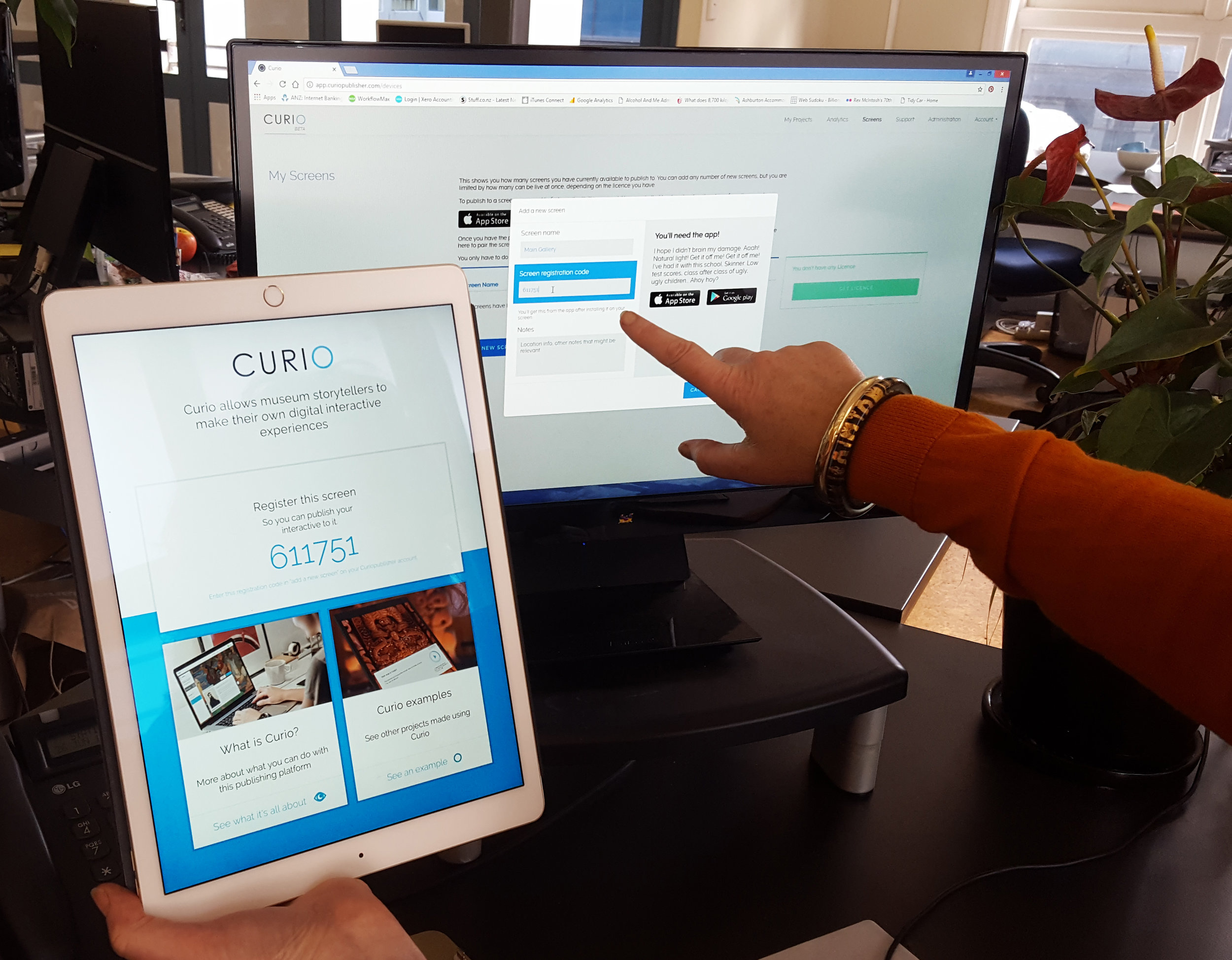
Custom Themes:
Themes you create can be shared by all the people and projects within your organisation. This means you can make a theme for an exhibition, to be used by all the interactives.
2. Interactive
Background colour:
Update the interactive background colour to match your hero image.
Content card colour:
This will update the background colour of the highlight and overview cards. Be mindful to keep a high colour contrast with this colour and the font colour. That will make it easy to read.
Title and subtitle:
Align your titles to the left or the right of the hero image. This will also position the language options on the opposite side of the screen to the title.
Overviews:
Align your overview buttons to the left, centre or right of the screen.
Content Card:
This lets you select where you want the content cards to appear: floating over the highlight, or stacked off to the side of the interactive (left or right).
Timeout:
This allows you to adjust the time it takes for the interactive to take itself back to the start (the zoomed out hero image) if there's been no interaction. The default time is 3 minutes (180 seconds) but you might want to adjust this.
If an audio (or video) track is playing, then that still counts as if someone is interacting - so the "no interaction" time is when no touches are detected, and no media is playing.
3. Highlights
Style:
Chose from three different highlight styles.
Size:
Set the size of your highlight on top of your hero image.
Un-selected colour & opacity:
Set the colour and opacity of the highlights before a user clicks on them.
Selected colour & opacity:
Set the colour and opacity of the highlight a user has clicked on.
Gradient:
This will add a soft shadow to your highlight icon.
4. Fonts
Title:
The main title for your interactive, this sits above the hero image.
Subtitle:
The subtitle for your interactive, this sits below the main title.
Content headings:
This is the typographic style for text headings in a highlight or overview.
Content body:
This is the styling for paragraph text within a highlight or an overview.
Captions:
This is the styling for the text that accompanies an image within a highlight.
Font Sizes:
You'll need to keep in mind the size of the screen you are publishing to. Publishing to an iPad, for example, your font size should be at least 20px for legibility.
5. Buttons
Button typography:
This sets the font, style and size of the font within the buttons.
Selected button:
This is the styling of the language and overview buttons that a user has clicked on, or is currently open or active.
Un-selected button:
This is the style for buttons that a user hasn’t selected, such as another language, or a closed overview.
Corner Radius:
This is where you change the button corner style. 100% will create buttons with perfectly circular corners, where as 0% will have buttons with square corners.
6. Audio
Primary Colour:
This is the main colour of the audio player.
Secondary colour:
This is the colour of the middle line that animates on as the audio plays, showing progress through the track.